The majority of visitors to most local business websites in Joplin, Springfield, Tulsa, and Northwest Arkansas are browsing on a phone, often while multitasking or on the go. A site that was designed on a desktop monitor and merely "shrinks to fit" almost always creates friction — tiny buttons, awkward menus, text too small to read. We design mobile-first, building the phone experience as the priority rather than an afterthought.
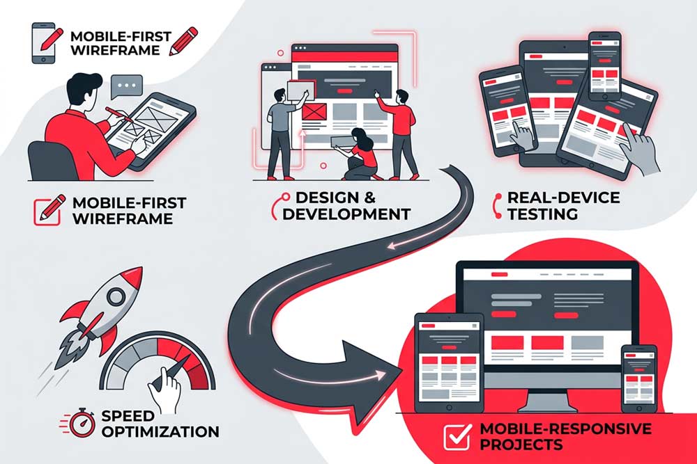
Mobile-responsive projects start with a mobile-first wireframe, mapping the experience for the smallest screen before scaling up. From there we move into design and development, followed by real-device testing across a range of phones and tablets, and speed optimization before launch.
A site that works perfectly on a laptop and frustrates someone on their phone has already failed most of its visitors before they read a word.
This service is a fit for any business whose current site feels clunky or slow on mobile, and it's built into every new website project we do for businesses across the four-state region from the start.
Google also indexes and ranks websites based primarily on their mobile version, not desktop. A site that performs poorly on mobile isn't just losing visitors directly, it's likely losing search visibility as well, which compounds the impact over time.
Yes, every website we build is mobile-responsive by default. This service is for businesses specifically needing to fix or improve mobile performance on an existing site without a full redesign.
Can you fix mobile issues on our current website without rebuilding it?Often, yes. Many mobile issues can be resolved with targeted fixes to specific templates and pages rather than a full site rebuild, depending on how the existing site is built.
How do you test across so many different phones and devices?We test across the most common device and browser combinations for your specific audience, combining real-device testing with responsive testing tools to catch issues before launch.