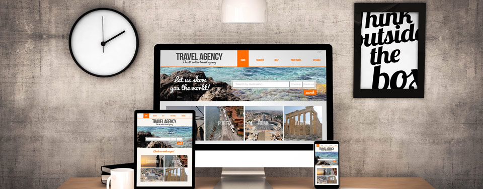


As consumers increasingly turn to their mobile phones, businesses are more mindful than ever of the increased revenue that is achieved by having a mobile-ready website. If your web page is not mobile-friendly, then this will hurt the perceived quality of your website and therefore negatively impact your Google ranking. You site will rank lower when someone searches on a mobile device.
Google rewards sites that offer a mobile friendly experience.
Mobile search has had a colossal impact on local search: especially for restaurants, hotels and retail establishments. Making your website mobile-friendly and responsive to all devices is no longer an option. It is a necessity.
There are three viable options when it comes to the development a mobile website: Responsive web design, dynamic serving or separate URL's.
Responsive design is an effective tool as it sends the same HTML code on the same URL for all devices, and renders the display and adjusts screen size based on the users desktop, tablet or mobile device. Google supports all three options when developed properly, but supports responsive design as the most effective configuration.
Dynamic serving uses the same URL but generates a different version of HTML based on the device. This is more difficult to implement and more expensive to maintain.
Parallel URLs serves different code to each device on its own unique URL, therefore two or more websites with their own unique URL are created. With this option you risk content duplication, an abundance of redirects. Parallel URLs are more expensive to maintain.
Responsive web design is Google's recommended design strategy for rendering mobile websites.
It requires less time to develop one website than to engineer multiple websites for different devices.
When it comes to website updates and maintenance the odds are more likely for you to make more mistakes when you have two or more websites to update. Having one unique URL reduces the possibility of mistakes in grammar, coding, content updates etc.
Having one unique url for your website, regardless of the device it is being used on, helps Google's algorithm to index your web page.
No redirection is needed based on the device, therefore reducing load time. A faster load time improves search engine ranking and the user experience.
Using one URL makes it easier for users to share and link to your content, which is one constant and reliable strategy in search engine optimization.
Mobile optimization increases Search Engine Optimization and is one of SEO's best practices.
Check to see if your website is mobile-friendly using Google's Mobile-Friendly Test. If you pass, you will receive the following message, "Awesome! This page is mobile-friendly."
At FourStatesMarketing.com we specialize in responsive mobile-friendly website design and development. Try out our URL (FourStatesMarketing.com) when using Google's Mobile-Friendly Test, or experience our mobile-friendly responsive website yourself using your own mobile device.
Logo Design
Brand Identity
Styleguide Development
Branding Guide Development
Business Card Design & Printing
Stationery & Envelope Design
Website Development
Website redesign
Mobile 1st
Responsive Web Design
Custom Word Press
Content Management System
HTML5, Bootstrap
Search Engine Optimization (SEO)
Social Media Marketing
Blog Development
Content Management
Copywriting
Rack Card Design & Printing
Brochure Design & Printing
Presentation Folder Design & Printing
Trade Show Booth Design & Printing
Flier and Sell Sheet Design & Printing
Never give up on what you really want to do. The person with big dreams is more powerful than one with all the facts.
– Life’s Little Instruction Calendar